Threat Summary Dashboard
The Threat Summary dashboard provides visibility into threats and incidents in your environment. Use this dashboard to gain insights into the types of incidents that were detected, analyze the effectiveness of your current incident response efforts, and learn about emerging threats. This dashboard includes visuals of the following data:
- Total incidents counts and statuses
- Open incidents by threat levels and incident trend
- Classification of your open incidents
- Countries where open incidents originate
- Most targeted deployments and hosts in open incidents
- Top attackers for open incidents
The Threat Summary dashboard is part of the Dashboards feature. For more information about Dashboards, see Dashboards.
Access the Threat Summary dashboard
To access the Threat Summary dashboard, in the Alert Logic console, click the menu icon (![]() ), and then click
), and then click ![]() Dashboards. Click the drop-down menu on the top left to see the list of available dashboards, and then click Threat Summary.
Dashboards. Click the drop-down menu on the top left to see the list of available dashboards, and then click Threat Summary.
Threat Summary visuals
If available, you can click Investigate in the visuals to be redirected to the corresponding page in the Alert Logic console and to take further action if necessary. You can also hover over an item in a visual to see a tooltip with additional details. You can also click items in the visuals to be redirected to the corresponding page in the Alert Logic console and to take further action if necessary. The corresponding page is already filtered with the data from the visual you clicked.
For visuals with information in a list, you can click Export To CSV to export the data in CSV format.
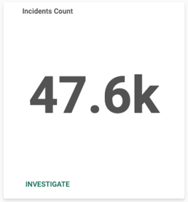
Incidents Count
This visual provides the total count of incidents for all statuses that Alert Logic detected in your environment during the selected date range. Click INVESTIGATE to go to the Incidents page and see more information on those incidents.
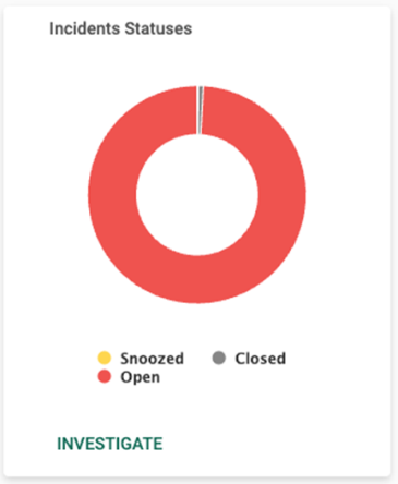
Incidents Statuses
This visual provides the count in each status for incidents that Alert Logic detected in your environment during the selected date range. Click INVESTIGATE to be redirected to the Incidents page to see more information on all the incident statuses in the visual, or click on an item to see specific data related to that incident status.
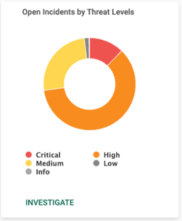
Open Incident Threat Levels
This visual provides the count of open incidents in each threat level for incidents that Alert Logic detected in your environment during the selected date range. Click INVESTIGATE to be redirected to the Incidents page to see more information on all the incident threat levels in the visual, or click on an item to see specific data related to open incidents for that threat level.
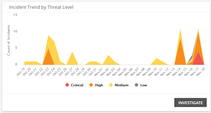
Incident Trend by Threat Level
This visual provides a graph that presents the incident, and threat level of those incidents, over the course of the selected date range. Click INVESTIGATE to be redirected to the Incidents page to see more information on all incident threat levels in this visual, or click on an item to see specific data related to that threat level on a specific day.
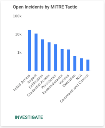
Open Incidents by MITRE Tactic
This visual provides a bar chart with the number of open incidents in each MITRE Tactic classification type. Click INVESTIGATE to be redirected to the Incidents page and see more information on all the MITRE Tactics in the visual, or click on an item to see specific data related to that MITRE Tactic.
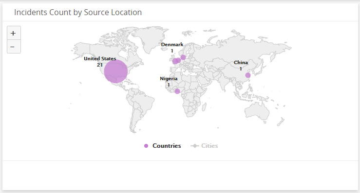
Open Incident Count by Source Location
This visual provides map that presents the Top 25 countries where incidents originate for open incidents that Alert Logic detected in your environment during the selected date range.
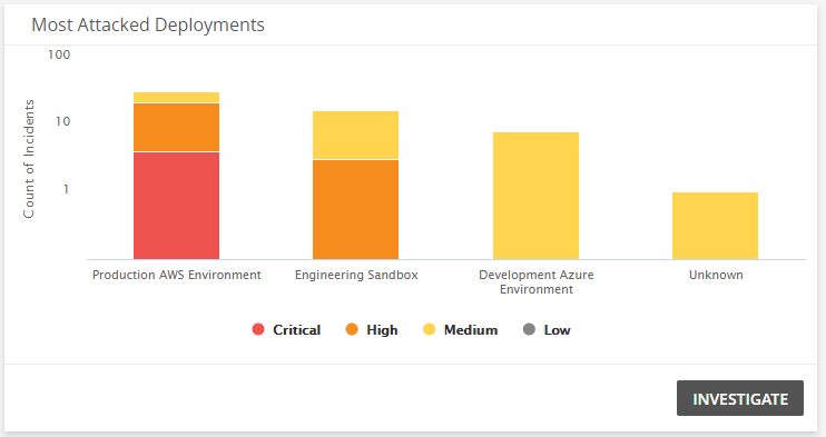
Most Targeted Deployments
This visual provides a bar graph that shows the count of open incidents, and threat levels of those incidents, in each of your deployments. Click INVESTIGATE to be redirected to the Incidents page and see more information on all the open incidents in the visual, or click on an item to see specific data related to open incidents for the selected threat level and deployment.
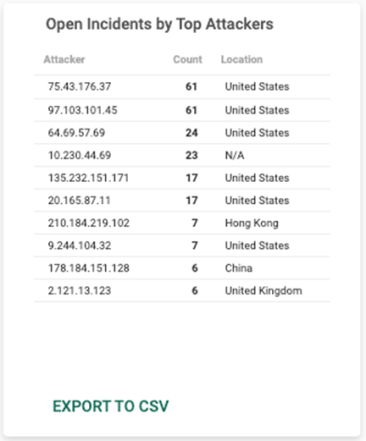
Top Attackers
This visual provides a list of top attackers seen the most in the open incidents that Alert Logic detected in your environment during the selected date range. Click EXPORT TO CSV to export the data in CSV format.
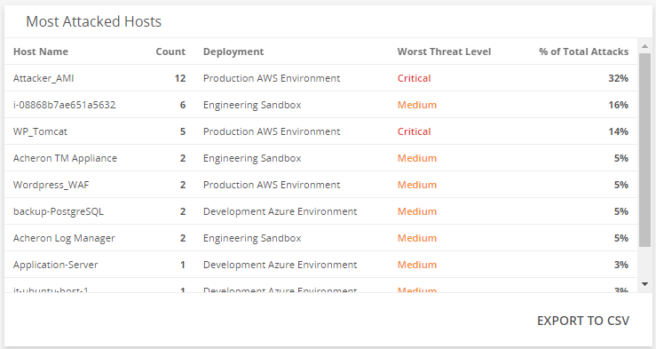
Most Targeted Hosts
This visual provides a list of hosts that have the most open incidents, the worst threat level on each targeted host, and the percentage of total attacks. Click EXPORT TO CSV to export the data in CSV format.