Monthly Vulnerability Change Trends
The Monthly Vulnerability Change Trends report provides a summary of the percentage and count changes of vulnerabilities, and trend by total and severity.
Alert Logic assigns
| Severity rating | CVSS v2 score range | CVSS v3 score range |
|---|---|---|
|
|
Not applicable | 9.0 - 10.0 |
|
|
7.0 - 10.0 | 7.0 - 8.9 |
|
|
4.0 - 6.9 | 4.0 - 6.9 |
|
|
0.1 - 3.9 | 0.1 - 3.9 |
|
|
0.0 | 0.0 |
Some vulnerabilities in the National Vulnerability Database have both CVSS v2 and CVSS v3 scores. Alert Logic displays the newer CVSS v3 score and severity rating in prominent locations and both scores in detail views. If only one CVSS score exists, Alert Logic uses that score and severity rating.
To access the Monthly Vulnerability Change Trends report:
- In the Alert Logic console, click the menu icon (
 ), and then click
  Validate.
 - Click Reports, and then click Vulnerabilities.
- Under Vulnerabilities Analysis, click VIEW.
- Click Monthly Vulnerability Change Trends.
Filter the report
To refine your findings, you can filter your report by Month, Customer Account, Deployment Name, Category, Severity, CVSS Score, and Asset Type.
Filter the report using drop-down menus
By default, Alert Logic includes (All) values for most filters in the report.
To add or remove filter values:
- Click the drop-down menu in the filter, and then select or clear values.
- Click Apply.
Schedule the report
After you finish setting up the report, you can use CREATE REPORT to run it periodically and subscribe users or an integration (such as a webhook) to receive a notification when the report is generated. To learn how to schedule the report and subscribe notification recipients, see Scheduled Reports and Notifications.
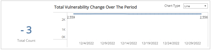
Total Vulnerability Change Over the Period section
The section shows changes in the total count change of vulnerabilities and a graph that presents the daily vulnerability count trend over the selected period of time.
You can display the data as a line or bar charts. Click the drop-down menu on the top right of the this section, and then select the chart type you want to see.
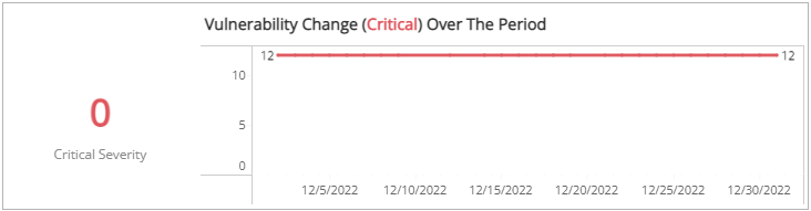
Vulnerability Change (Critical Severity) Over the Period section
The section shows changes in the total count change of the vulnerabilities categorized in the critical severity rating and a graph that presents the daily critical severity vulnerability count trend over the selected period of time.
You can display the data as a line or bar charts. Click the drop-down menu on the top right of the Total Vulnerability Change Over the Period section, and then select the chart type you want to see.
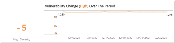
Vulnerability Change (High Severity) Over the Period section
The section shows changes in the total count change of the vulnerabilities categorized in the high severity rating and a graph that presents the daily high severity vulnerability count trend over the selected period of time.
You can display the data as a line or bar charts. Click the drop-down menu on the top right of the Total Vulnerability Change Over the Period section, and then select the chart type you want to see.
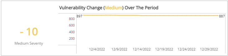
Vulnerability Change (Medium Severity) Over the Period section
The section shows changes in the total count change of the vulnerabilities categorized in the medium severity rating and a graph that presents the daily medium severity vulnerability count trend over the selected period of time.
You can display the data as a line or bar charts. Click the drop-down menu on the top right of the Total Vulnerability Change Over the Period section, and then select the chart type you want to see.
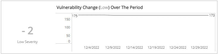
Vulnerability Change (Low Severity) section
The section shows changes in the total count change of the vulnerabilities categorized in the low severity rating and a graph that presents the daily low severity vulnerability count trend over the selected period of time.
You can display the data as a line or bar charts. Click the drop-down menu on the top right of the Total Vulnerability Change Over the Period section, and then select the chart type you want to see.