Monthly Vulnerability Distribution Explorer
The Monthly Vulnerability Distribution Explorer report provides insights into patterns from the vulnerabilities found in your environment, including vulnerability distribution and trends categorized by status, exploitability, severity, age, operating system, and asset type. Use this report to help you optimize your vulnerability management process.
To access the Monthly Vulnerability Distribution Explorer report:
- In the Alert Logic console, click the menu icon (
 ), and then click
  Validate.
 - Click Reports, and then click Vulnerabilities.
- Under Vulnerabilities Analysis, click VIEW.
- Click Monthly Vulnerability Distribution Explorer.
Filter the report
To refine your findings, you can filter your report by Month, Customer Account, Deployment Name, Category, Severity, CVSS Score, and Asset Type.
Filter the report using drop-down menus
By default, Alert Logic includes (All) values for most filters in the report.
To add or remove filter values:
- Click the drop-down menu in the filter, and then select or clear values.
- Click Apply.
Schedule the report
After you finish setting up the report, you can use CREATE REPORT to run it periodically and subscribe users or an integration (such as a webhook) to receive a notification when the report is generated. To learn how to schedule the report and subscribe notification recipients, see Scheduled Reports and Notifications.
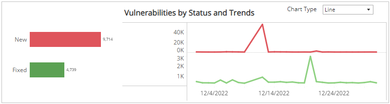
Vulnerabilities by Status and Trends section
This section shows the distribution of status categories and trend of vulnerabilities over the selected months in the selected filters. The status categories are the following:
- New: First seen in the selected weeks
- Fixed: Not seen after the last scan in the selected weeks
The color-coded bar represents the total vulnerability count in each status category, along with a chart that presents the daily trend over the selected weeks of those vulnerabilities.
You can display the trend data as a line or bar chart. Click the drop-down menu on the top right of this section, and then select the chart type you want to see.
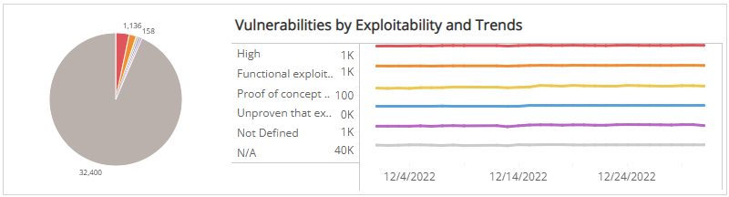
Vulnerabilities by Exploitability and Trends section
This section shows the distribution of exploitability categories and daily trend of vulnerabilities over the selected months in the selected filters. The exploit availability categories are the following:
| Category | Exploit Code |
|---|---|
| High | Exploit code works in every situation, or is being delivered via autonomous agent |
| Functional exploit exists | Exploit code is available and works in most situations where the vulnerability exists |
| Proof of concept | (Exploit code is not functional and may require substantial modification by a skilled hacker |
| Unproven that exploit exists | Exploit Code is not available or is entirely theoretical |
| Not Defined | Exploit availability not defined |
| N/A | Exploit availability unknown |
The color-coded pie chart presents the total vulnerability count in each exploit availability category, along with a chart that presents the daily trend over the selected months of those vulnerabilities.
You can view the trend data as a line or bar chart. Click the drop-down menu on the top right of Vulnerabilities by Status and Trends section, and then select the chart type you want to see.
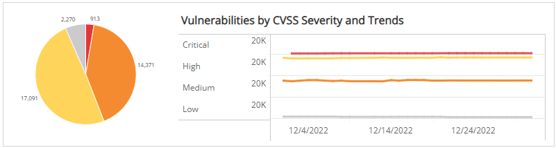
Vulnerabilities by CVSS Severity and Trends section
This section shows the distribution of CVSS severity categories and daily trend of vulnerabilities over the selected months in the selected filters.
Alert Logic assigns
| Severity rating | CVSS v2 score range | CVSS v3 score range |
|---|---|---|
|
|
Not applicable | 9.0 - 10.0 |
|
|
7.0 - 10.0 | 7.0 - 8.9 |
|
|
4.0 - 6.9 | 4.0 - 6.9 |
|
|
0.1 - 3.9 | 0.1 - 3.9 |
|
|
0.0 | 0.0 |
Some vulnerabilities in the National Vulnerability Database have both CVSS v2 and CVSS v3 scores. Alert Logic displays the newer CVSS v3 score and severity rating in prominent locations and both scores in detail views. If only one CVSS score exists, Alert Logic uses that score and severity rating.
The color-coded pie chart presents the total vulnerability count in each CVSS severity category, along with a chart that presents the daily trend over the selected months of those vulnerabilities.
You can display the trend data as a line or bar chart. Click the drop-down menu on the top right of Vulnerabilities by Status and Trends section, and then select the chart type you want to see.
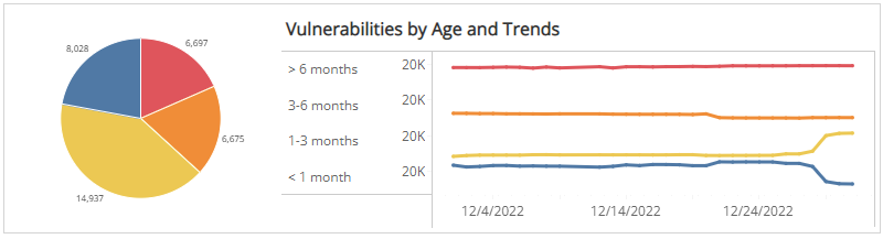
Vulnerabilities by Age and Trends section
This section shows the distribution of age categories and daily trend of vulnerabilities over the selected weeks in the selected filters. The age categories are the following:
- Over 6 months
- 3-6 months
- 1-3 months
- Less than 1 month
The color-coded pie chart presents the total vulnerability count in each age category, along with a chart that presents the daily trend over the selected months of those vulnerabilities.
You can display the trend data as a line or bar chart. Click the drop-down menu on the top right of Vulnerabilities by Status and Trends section, and then select the chart type you want to see.
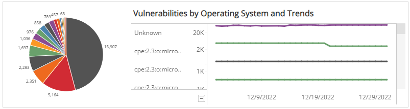
Vulnerabilities by Operating System and Trends section
This section shows the operating systems and daily trend of vulnerabilities over the selected months in the selected filters. The operating systems are the following:
- Linux
- Unbuntu
- Windows Server
- Unknown (Operating system could not be determined during scan)
The color-coded pie chart presents the total vulnerability count in each operating system, along with a chart that presents the daily trend over the selected weeks of those vulnerabilities.
You can display the trend data as a line or bar chart. Click the drop-down menu on the top right of Vulnerabilities by Status and Trends section, and select the chart type you want to see.
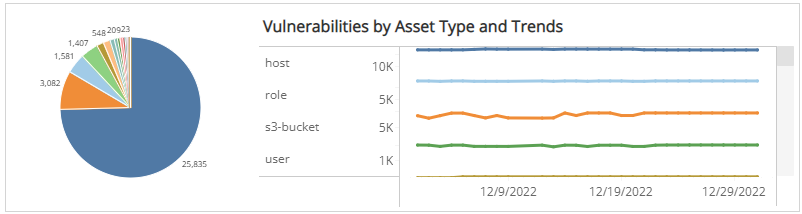
Vulnerabilities by Asset Type and Trends section
This section shows the distribution of asset types and trending of vulnerabilities over the selected months within the selected filters. There are dozens of asset types, including the following representative examples:
- Region
- Deployment
- Security Group
- VPC
- DNS Zone
- Load Balancer
- Host
- Volume
- User
The color-coded pie chart presents the total vulnerability count for each asset type, along with a chart that presents the daily trend over the selected months of those vulnerabilities.
You can display the trend data as a line or bar chart type. Click the drop-down menu on the top right of Vulnerabilities by Status and Trends section, and then select the chart type you want to see.