Incident Workflow Explorer Report
The Incident Workflow Explorer report tracks and evaluates daily workflow actions performed in the Incidents console to determine how often incidents are suppressed from reports, the Incident summary page, and the Security Posture page.
For more information about incidents, see Incidents.
To access the Incident Workflow Explorer:
- In the Alert Logic console, click the menu icon (
 ), and then click
  Validate.
 - Click Reports, and then click Threats.
- Under Incident Analysis, click VIEW.
- Click Incident Workflow Explorer.
Filter the report
To refine your findings, you can filter your report by Create Time, Customer Account, Deployment Name, Detection Source, and Escalation Status.
Filter the report using drop-down menus
By default, Alert Logic includes (All) values for most filters in the report.
To add or remove filter values:
- Click the drop-down menu in the filter, and then select or clear values.
- Click Apply.
Schedule the report
After you finish setting up the report, you can use CREATE REPORT to run it periodically and subscribe users or an integration (such as a webhook) to receive a notification when the report is generated. To learn how to schedule the report and subscribe notification recipients, see Scheduled Reports and Notifications.
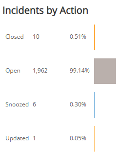
Incidents by Action section
This section provides the counts and percentages of total incidents you closed, open, updated, and snoozed for the filters you selected. The color-coded bar represents the number of times you performed that workflow action in the selected filters.
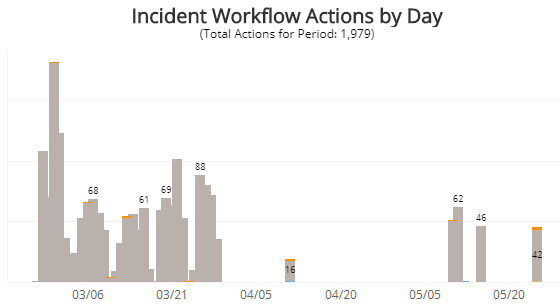
Incident Workflow Actions by Day section
This section displays a stacked histogram chart that displays the total daily workflow actions performed in the selected filters.
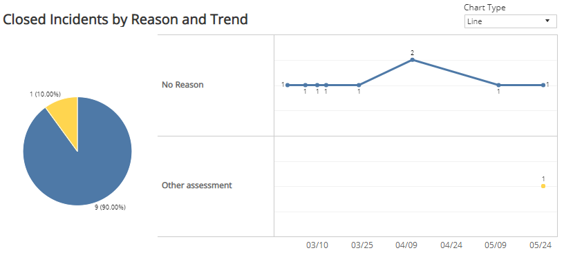
Closed Incidents by Reason and Trend section
This section displays a color-coded pie chart with the counts and percentages of the feedback reasons specified when users closed incidents. The data next to the pie chart presents the trend over the selected time period of the feedback reasons those incidents were closed.
You can display the data as a line or bar chart. Click the drop-down on the top right of this section, and select the chart type you want to see.
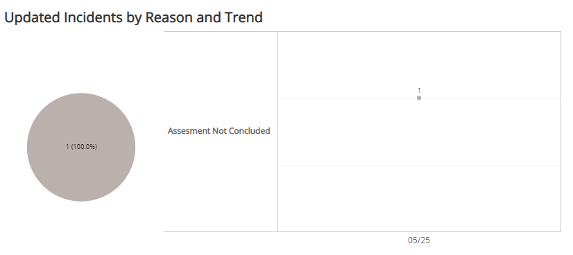
Updated Incidents by Reason and Trend section
This section displays a color-coded pie chart with the counts and percentages of the feedback reasons specified when users updated incidents. The data next to the pie chart presents the trend over the selected time period of the feedback reasons those incidents were updated.
You can display the data as a line or bar chart. Click the drop-down on the top right of the Closed Incidents by Reason and Trend section, and select the chart type you want to see.